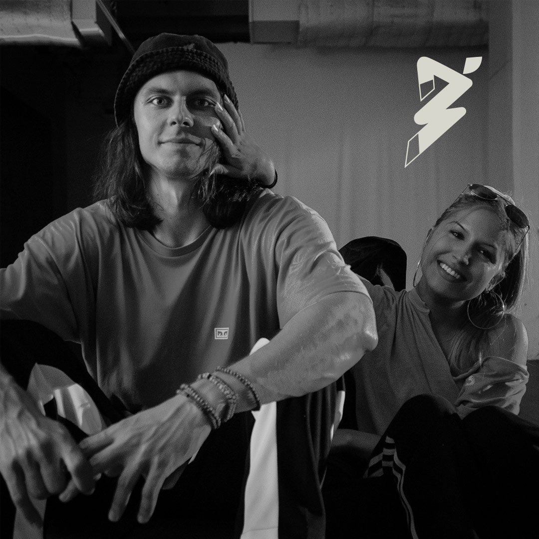
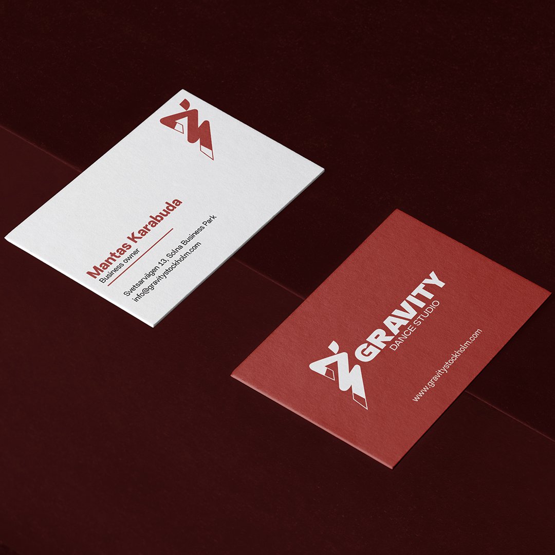
Gravity was started by Mantas and Elin, a space built for a community of dance enthusiasts.
Project Mission
Develop an Energetic, Creative Brand identity for Gravity Dance Favouring Self-expression
Project Type : Full Rebrand
Industry : Dance & Performing Arts
Service : Strategic Branding | UI/UX
Problem
The Studio Grew. The Brand Didn’t.
As Gravity Dance Studio evolved into an international hub with guest teachers, traveling students, and a fast-growing community, its visual identity stayed stuck in the past. What once “looked good” no longer reflected the scale, energy, or diversity of the studio’s current reality. The original branding couldn't keep up with the shift from a small local team to a vibrant global dance space. With a move to a bigger location, it became clear, it was time for the brand to grow up too.
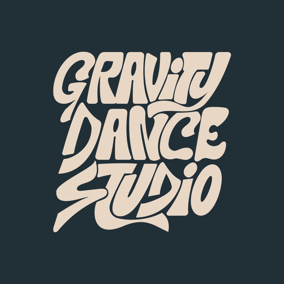
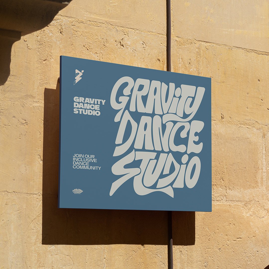
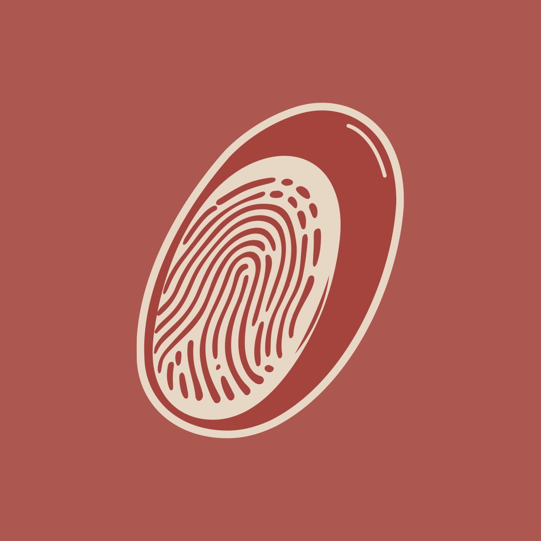
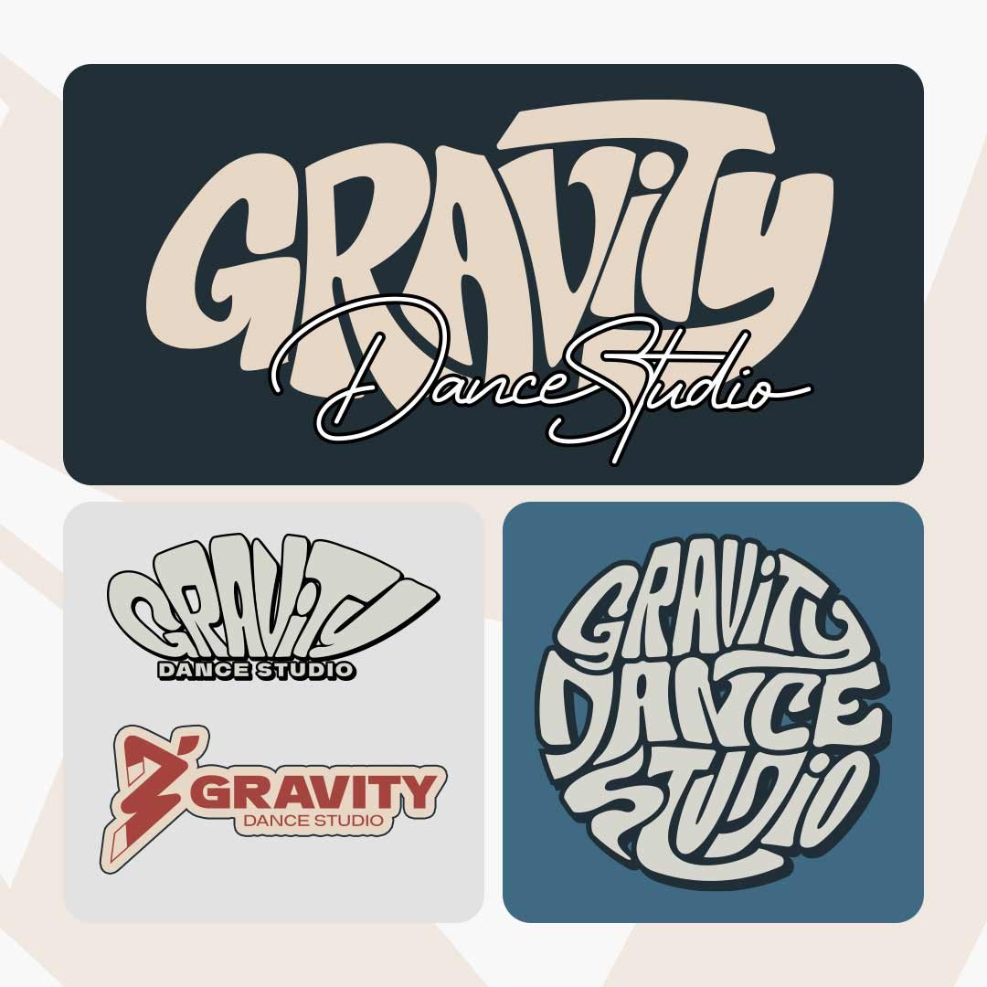
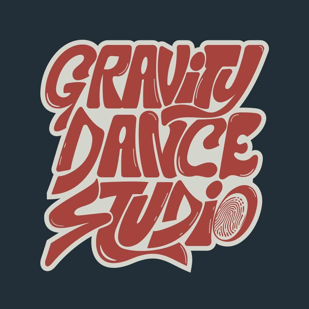
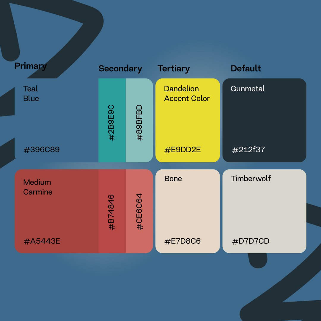
Meaning behind the mark.
The concept captures the brand’s character and movement, reflecting its core values. This monogram design incorporates the three main letters G, D, and S into a unified, cohesive form, symbolizing a dynamic personality, almost like a dancer. The symbol brings together key elements: the magnetic energy of the brand, the initial letters, and the dancer-like figure. This design embodies movement and brand authenticity, making it timeless, readable, and true to the brand’s essence.
Illustrations
Why Illustrations Still Mattered in the Rebrand
During the rebrand, we debated whether illustrations were still worth the investment. The client questioned if that energy could be better spent elsewhere.
But after analyzing GDS’s two key audiences, existing young dancers (17 to 22) and new pre-teens (12 to 15), we agreed that illustration wasn’t just aesthetic, it was strategic. Playful, figurative visuals speak directly to younger audiences and help GDS stand out in a templated, repetitive dance studio space. That’s why we created two dynamic teen characters, bridging fun, energy, and brand personality while reinforcing connection with GDS’s most engaged and future customers.
(What we achieved)
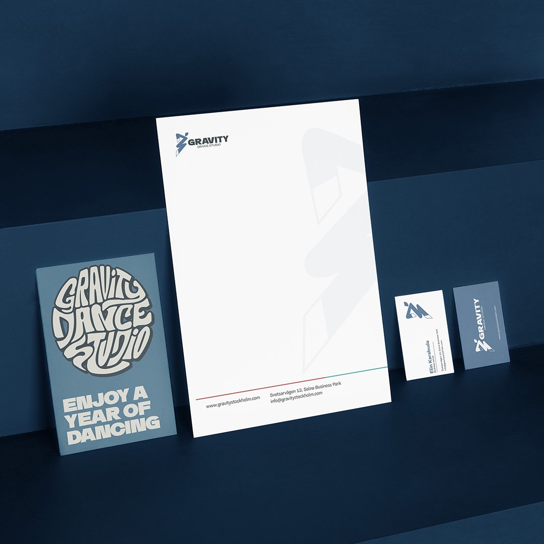
Refreshed the visual identity
Designed two teen illustrations
Built a flexible brand system
Balanced typography and imagery
Aligned visuals with audience needs
Execution
Launching the Brand with Strategic Execution.
With the rebrand complete, we moved into a focused launch campaign. The goal was to notify existing users about the new venue and reward them with early access, while attracting new users through a free trial class. The campaign ran in two phases. First, we nurtured the existing community with gratitude and exclusivity. Then, we built public hype through targeted messaging on social media and email, using the free trial offer to collect leads and drive clear, trackable actions.
Email Campaign Results and Real Impact
The awareness campaign focused on a free trial offer, launched through targeted email marketing and social media. The emails were crafted with strategic messaging, leading to high open and click-through rates.
We also saw direct responses from the audience, with multiple users confirming sign-ups via DMs. This confirmed the funnel was working — from awareness to action. The campaign not only drove interest for the grand opening but also created a measurable uplift in engagement, traffic, and lead conversion.
(What we achieved)
Wrote and designed high-converting email sequence.
Drove trial sign-ups through CTA-driven messaging.
Created a seamless awareness-to-conversion funnel.
Tracked user response to validate campaign effectiveness.
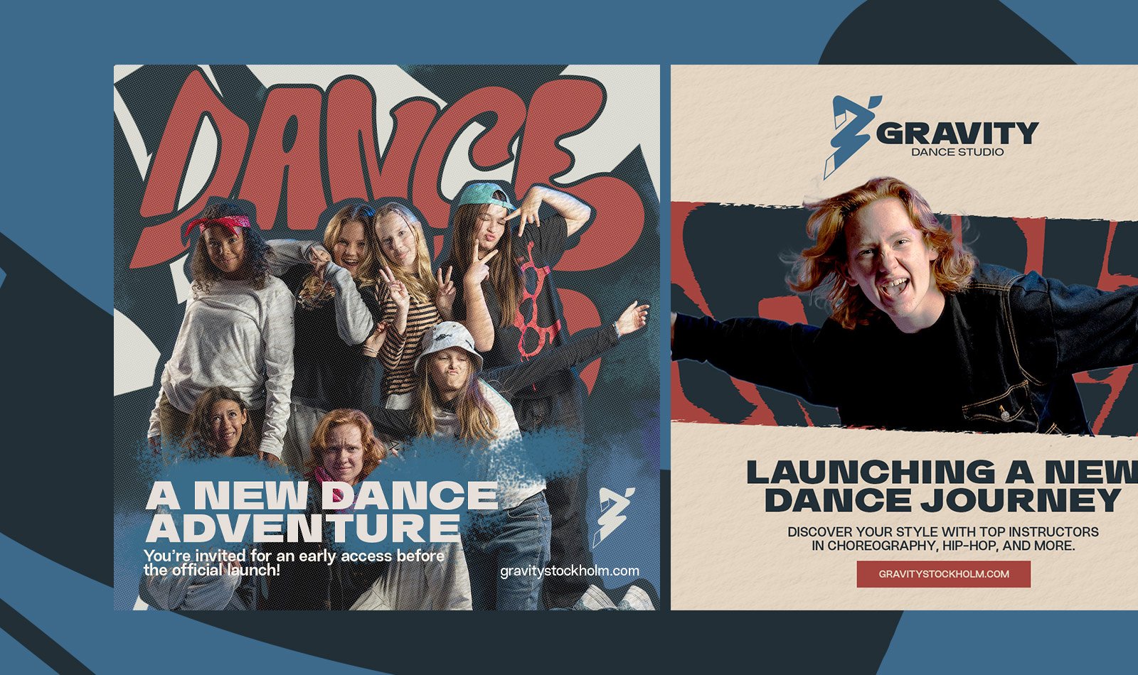
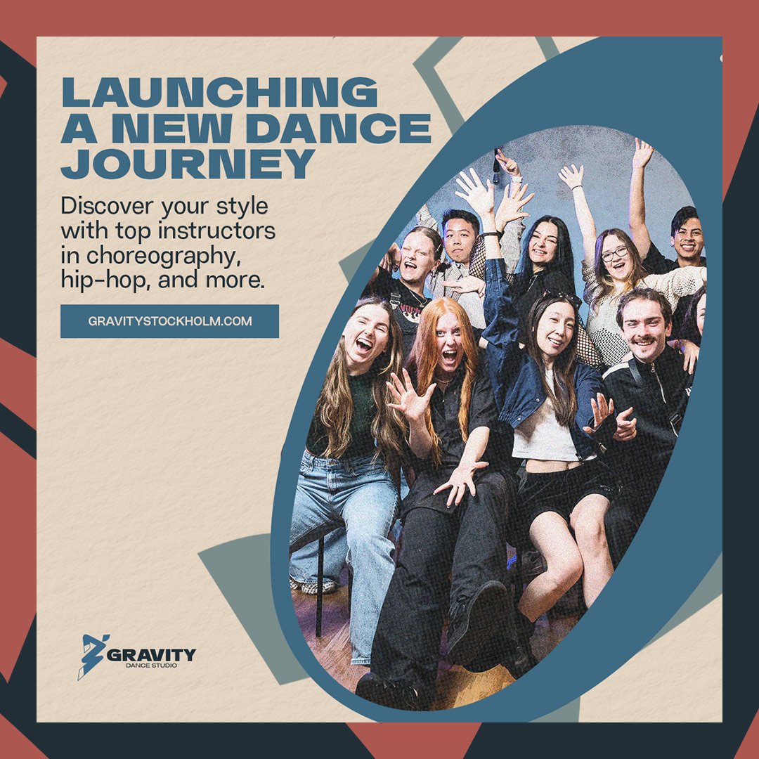
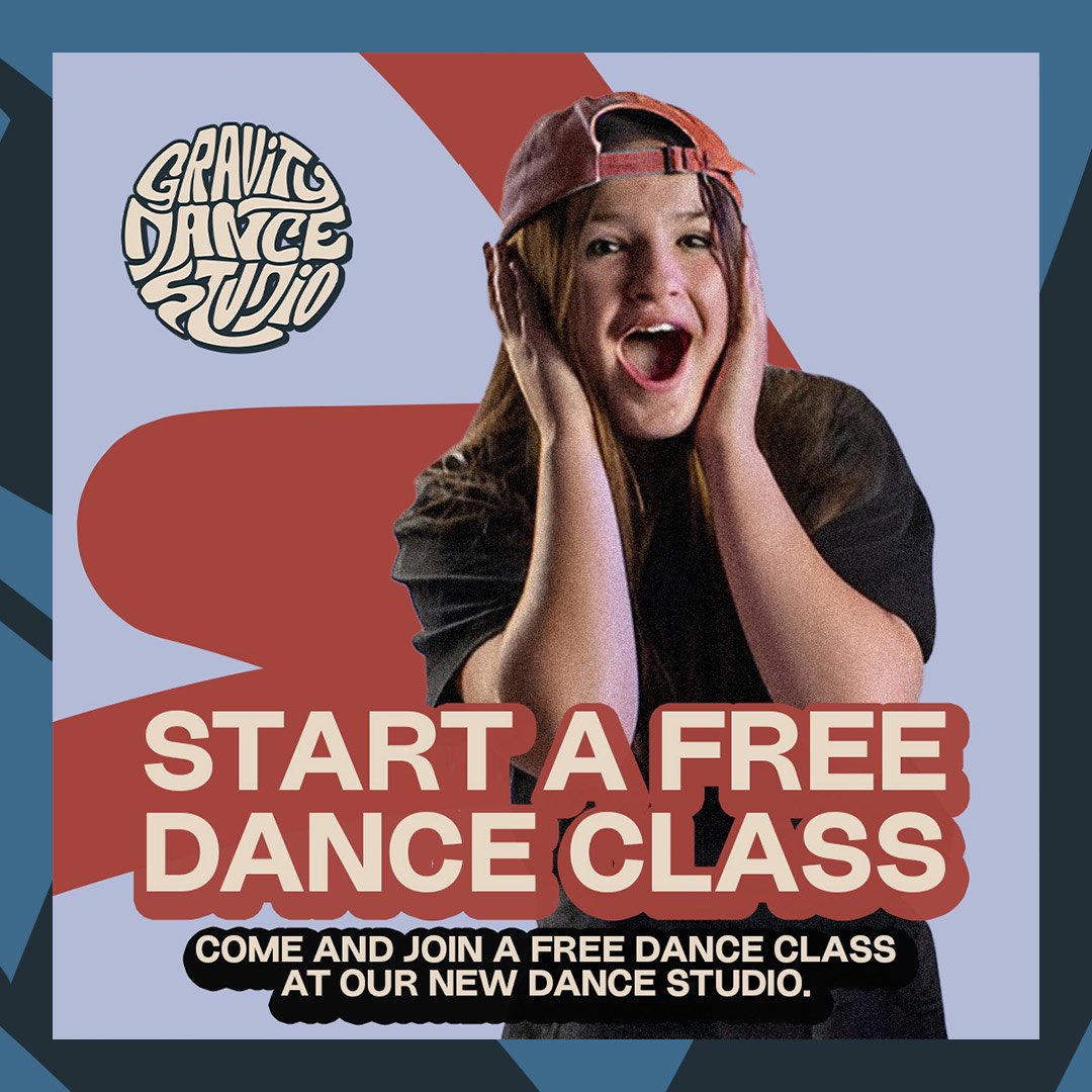
Designing the Campaign Assets That Drove Action.
I produced high-performing content for GDS’s grand opening campaign, including Reels, IG Stories, static posts, and printed flyers.
Each asset was built to drive awareness, collect leads, and convert sign-ups for the free trial offer. Everything followed the brand system for consistent, clear communication across all channels.
Key Achievements from the campaign
Achieved a winning ad creative that brought strong engagement and high click-through rates
Collected over 1200+ leads through the free trial landing page
Drove a spike in DMs and direct sign-ups from email and IG content
Helped build momentum ahead of the venue opening with consistent visuals and CTAs
UI/UX Design
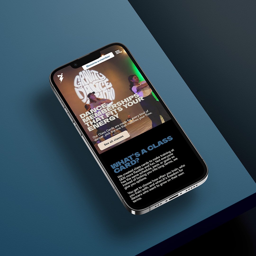
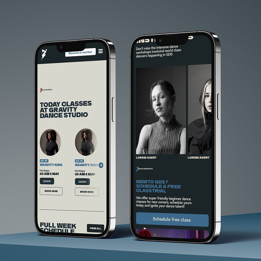
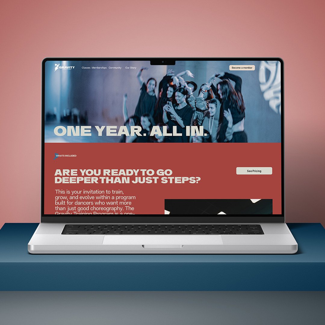
We built a new website to deliver a seamless dance experience.
GDS was previously using Wix Classic, but the platform lacked the flexibility and structure needed for the studio’s growing needs. I proposed building a completely new website in Wix Studio to deliver a smoother and more modern experience.
The new site was designed to let users easily schedule classes, purchase memberships, and access their personal dashboard. It also clearly presents the studio’s core offerings, including workshops, memberships, weekly classes, teacher profiles, dance styles, and upcoming events, all within a cohesive and branded user journey
Let’s bring your boldest ideas to life.
Are you ready to build a brand that actually attracts, connects, and scales? Send me an inquiry. Let's talk.